
If you don’t do this one thing, you might as well delete all photos from your site
Did you know the photos on your tourism website are actually annoying more people than they are attracting? I hadn’t thought of this, but Andy Hayes explained it, in “Why Photos on your Travel Website Can be a Bad Idea.” I’ll give you the summary here, along with the action plan to fix it.
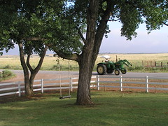 |
| Lovely! But where the heck is it? (It’s Sage and Saddle B&B, near Freedom, Oklahoma.) |
You put lovely photos of your place on your website. You even have some great photos on a rotating graphic. Great! Now I want to visit.
The Problem: You didn’t tell me where those photos were taken. And I can’t figure it out, because I’ve never been there. To make it worse, those rotating graphics make it impossible to stop and look at a specific photo or location.
Go back and read Andy’s post, Why Photos on your Travel Website Can be a Bad Idea, to understand just how frustrating this is to your visitors.
The Simple Answer: Put every picture in context. Add a caption under every single photo. Use alternate text with every single image. Use the Title field to add text that appears when users hover with their mouse. Use all of these tricks on all images. Remember, for example, that iPad users can’t “hover” over an image, so they won’t see title tags. Screen reader users rely on alternate text.
It’s a lot of work to re-fit all the images on your site. Do it page by page, step by step. For the future, save a copy of Andy’s reminder in your file where you’re keeping ideas for your next website changes. That way you won’t forget to do this for all the images in your next upgrade.
Thanks, Andy, for giving us all a swift kick on this one.
New to SmallBizSurvival.com? Take the Guided Tour. Like what you see? Get our updates.
- About the Author
- Latest by this Author

Becky started Small Biz Survival in 2006 to share rural business and community building stories and ideas with other small town business people. She and her husband have a small cattle ranch and are lifelong entrepreneurs. Becky is an international speaker on small business and rural topics.


Great advice Becky. After all these years, I learned that the title tag shows up when you hover over the picture. I never knew that.
Thanks, Fred. That trick usually works, but not all browsers display it the same. Bottom line: use every trick you can to communicate with your visitors. The hard part is remembering they don’t know everything about your place.
Thank you, Becky, for mentioning alternate text! I’m glad to see some people are paying attention.
One of my clients is a youth camp and we are working on a photo strategy. Putting the pictures into context and making sure they are presented with authenticity is so important. For example, I was adding photos to last year’s blog posts that didn’t have pictures. I found one that fit the theme of a particular post, but it was taken two years prior. Considering the post was talking about current events, it would not have been authentic to use an old photo.
Glenda, of course I mentioned alternate text. I knew you would be listening.
Sandra, that’s a good point. If you plan to use an older photo in a current post, label it honestly.
Very interesting idea. Definitely something to think about. Usually, I think captures take away the visual appeal of a website. But if the goal is to get people to actually visit the site, it probably makes sense to make it easy for people to find the place. I really like the idea of connecting images to a Google Map of the location. I’m wondering, how do you think this concept applies to community websites, ones that don’t focus on tourism?
Hi Becky,
After reading your post, one realizes that there are little things that we might not be paying attention to however, it is exactly those things that may possibly be bothering the visitors on our site. Thank you so much for highlighting this. Will definitely keep this in mind. Thanks for sharing!
Riya Sam
Mike, I do think general community sites, even those not focused on tourism, ought to remember that tourists find them, too, when searching. And new people move to town, and not everyone knows what all is around them. In short: Yes. Definitely.