Business cards hold an enduring fascination for me. Sifting through the thousands I’ve collected, I have a few ideas to make your business cards more effective.
I’m not talking about the cool kid, all graphic-design-y, work of art, hunk of metal, whatever cards. I’m talking about business cards that work for business. If you go to any in-person events or conferences, you need business cards, sure enough.
I’ve pulled some examples out of my collection, including a bunch of modern designs collected this year from SXSW, SOBCon08, and BlogWorld Expo. Of course, many of these are a great example in one respect, but have other flaws. I’ll try to point those out as I go.
1. Keep it simple.
Ideas:
- @paulswansen reminded me of the “KISS” Keep It Simple principle.
- @jillbrowne pointed out that big print is also better if you want them to be read.
- @epodcaster mentioned that people like to write on cards. Leave space for them to do so, and be sure to leave at least one side un-coated.
- @__Deb shared that she just wrote about business card basics at Punctuality Rules!
Examples:
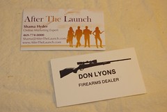
- Shama Hyder (After The Launch) has nice big print.
- Don Lyons is carrying simple to an extreme here. There is no phone number or other contact info at all, not even on the back. But, hey, it is certainly readable!
2. Update them.
Ideas:
- Get new cards printed. Don’t even be the one handing out cards with handwritten corrections or outdated info.
- Use multiple cards, if you need multiple identities. Don’t put it all on one card.
Our friend Bob Sawyer (Pixels and Code) shared this from a forum discussion:
Many designers/devs tend to wear a lot of hats, so they have several different cards printed for different services/audiences (tight designs for the tech crowd, plain white for the corporate crowd, etc.). Though you can never go wrong with the minimal approach.
Examples of Updating Info and Multiple Cards:
- I picked these two up about a year apart. Thank goodness they finally printed new cards!
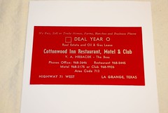
- Here’s a card that offers to buy/sell/trade real estate and oil and gas leases, then promotes a restaurant, motel and club. See what I’m sayin’ about having more than one card?
3. Add value on the back.
Ideas:
- Offer something for free.
- Include a conversation starter.
- Give them something they can use and that is related to your business. Calendars and football schedules are OK, but only if they relate to your business.
Examples of Adding Value:
- Here’s the amazing Shama Hyder again, this time offering a free ebook on the back of her card.
- The Top 5 Small Town Advantages is, of course, the back of my own card. It’s a conversation starter. People from small towns immediately connect to that list.
- The drink recipes are the back of my liquor store business cards. Recipes are valuable to customers and relevant to our business.
4. List your benefits
Ideas:
- Put together a very short, very meaningful list of benefits.
- The back is probably the best place to put it.
- Don’t crowd it in. Cut it down.
Examples of Listing Benefits:
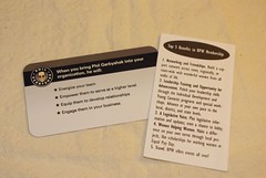
- Here we have the very cool Phil Gerbyshak (Make It Great) doing it right.
- And me doing it wrong, with tiny, tiny type! (No, I don’t use this design any more.)
5. Create credibility.
Ideas:
- Use a mini-resume. Out of my thousands of cards, I have only one solitary example of this. You’d think more people would take on that idea.
- Quote some endorsements. Make sure they are short and relate to your core idea.
- List some big name clients.
Examples to Create Credibility:
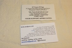
- The mini-resume is on a re-election card for the Alva City Marshal Arlo Darr. (Always did think that was a cool name for the marshal.)
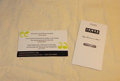
- The second card is Jon Swanson, quoting a compliment from Easton Ellsworth.
- Colleen Wainwright (Communicatrix) gives three offbeat quotes of endorsement, all of which suit her style.
- Angel Djambazov (Custom Tailored Marketing) lists three clients and implies that more a coming by leaving white space at the end of the list. Nice touch!
5. Use design tricks wisely.
Ideas:
- Need to personalize cards for a large group? Leave room for their signature. Also works for high-turnover positions.
- Use a punch out or die cut to enhance your design. It’s memorable, and still machine readable.
- Use curved corners, if it suits your design.
Examples of Design Tricks:
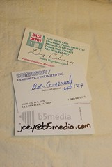
- These three are examples for using a signature to personalize a group card, including one from b5 media. You can tell the other two are fairly old ones from the archive. Love that 3.5″ inch floppy logo!
- There is only one card I’ve seen with an actual use of the punch out. (see the update below) It’s in an article that Bob Sawyer shared with me. He found it in a forum discussion. The example is in How Magazine’s story on business cards. Their examples are all really, really design heavy. BUT the very last one, for Bluefish Design, has a punch out! Hurray!
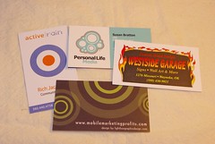
- Any one of these cards could have used a punched hole, done with a standard hand held hole punch.
- The flaming card is for a metal cut-out art place. Seems like a great reason to do a cut out flame! Haven’t you seen those little decorative hole punches? Could make for a memorable card.
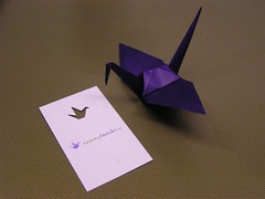
- Update: Tammy Lenski uses a punch out! The origami bird is her logo, and she has a tiny cutout of it on her card.
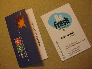
- Update: Drew McLellan and Pieter van Osch both use cutouts, as well. Drew’s has a starburst, and Pieter’s has a simple round hole. (Intriguingly, I picked up all three of them at the same event: SOBCon.)
Round edges are coming into fashion popular now. Here are four good examples I’ve picked up this year.
- Rick Calvert’s (BlogWorld Expo) card echoes the rounded logo in the center.
- On Gary V’s (Wine Library TV) card, the curved corners suit the liquid logo he uses.
- For Jason Falls (Social Media Explorer), only two corners are rounded.
- Britt Raybould’s (Bold Words) card uses the soft edges along with the fun caricature to give an informal feeling.
6. Don’t use these ideas, unless…
These are design features you should generally avoid, unless you have a good reason to use them.
Ideas
- Only use fold over cards if you are going to use them as table-top display items.
- Be careful in using funny materials. Bob said this also came up in the forum discussion. Lexan and plastic cards seem to be regaining favor.
- Also be careful of oversize and undersize cards. Big ones stick out and get crumpled. Small ones fall out and get lost! Both are hard for scanners to process.
Examples of Ideas to Use Carefully:
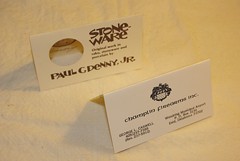
- Generally, I’m not big on fold over cards, except when it serves a good purpose. Both of these small businesses use their cards as price tags in show booth displays. Makes sense!
- The blue card is a translucent plastic, and decades old. (The red card from point #2 above is also translucent plastic.) So although plastic is “hot” topic in design now, it isn’t a new idea.
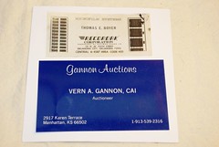
- The top card is actual microfilm. And it’s for a guy who actually sold microfilm equipment. That is cool!
- A stack of oversize and undersize cards. I’m just not a fan of this trick. Use with caution.
7. Budget for good cards.
One final idea that Bob Sawyer collected from a forum discussion:
I have heard that ideally you should spend 20% of your annual gross profits on promotion and marketing, which includes, obviously, business cards.
8. Your card.
Proud of your own card? Share what makes it special in the comments.
New to SmallBizSurvival.com? Take the Guided Tour. Like what you see? Get our updates.






Great article, Becky!
Very timely. I’m in the process of trying to decide if/how to change the look of my business card. Still didn’t reach any conclusions, but I will sift through all of the advice again and see what I come up with.
Thanks for all of your wonderfully appropriate posts!
Thank you, Paige. Hope you find an idea that works for you.
Some good stuff here, Becky.
I’d add a few more things: the rounded corners has been in fashion for a while, and is mainstream now. So if you’re doing it to be (way) different, that ship has sailed.
As with most things marketing (or anything), content is king and off-target renders things useless or silly. Don’t do ANYTHING just to be clever or stand out; do what’s appropriate for you. Which means, for most people (I’m thinking DIYers, but it would also apply if you’re going to a pro), get your message on point, then get creative.
Finally, if you want to see a GREAT example of design, execution and yes, hole punching, I give you Joshua Strebel’s SXSWi card this past year:
http://sxswcards.com/2008/03/06/joshua-strebel/
Talk about a slice of awesome pie.
Great use of business card samples. The examples certainly help tell the business card tale.
Communicatrix, thanks for adding your thoughts. You get bonus points because your website and card are consistent in message and design. Actually, all your stuff is consistent!
Jennifer, thanks! I knew that collection would come in handy some day! :)
On #3, I’ve found that leaving the back of the card blank actually works better for me. That way I have a spot for notes, which comes in handy if the person I’m talking with doesn’t have a card of their own.
I’ll even hand my card to someone who needs to jot down a number or a note but doesn’t have anything to write on.
Chris, you aren’t the only one. Jennifer Navarrete agrees with you.
I used a local graphics shop in town for my cards; got a great design, now personally know my card designer and helped a local biz, to boot.
Something to consider when traveling to another country – I’m going to China on business in a few weeks, and I’d like to have some info in Chinese on my card. I think I’m going to have my name and Web site, in kanji, put on stickers to go on the back of a batch of my cards. Thanks to Becky for working with me on the idea!
Bonus points to Sheila for supporting her local design shop!
Thanks a lot.. It game me some ideas to proceed for a new Business card.. I ll share the new card with u