
Is it already time to forget mobile?
You know more and more people are using their phone to access the web, and you know that you need to make a mobile friendly site, especially for tourism. But wait, new advice is coming out: can you skip doing a mobile site?
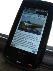 |
| “Not that smart” phones like mine will be around for several years more |
At a recent major tourism conference, a speaker advised against creating mobile-friendly websites for your destination. The reason? Mobile browsers are getting so good, that real soon they will be able to display your regular page with no modifications. So there’s no need to invest in creating a whole new site.
I think this is bad advice for two reasons.
1. “Real soon” is relative. Even as the cutting edge browsers get better, it will take time to get those out into the hands of real people. How many not-so-advanced mobile phone browsers are out there right now in the hands of your potential visitors? How many more not-so-advanced phones are they buying every day?
2. People want different information when they are on the go. Think about what information you need when visiting a new town. My guess is people want information on the events happening today, basic attraction information, and other info that is not easy to get from Google or Yelp.
How can you tell what mobile visitors really want? Check your current site’s analytics. Look for the number and type of mobile browsers used. Also check the pages with the most mobile views.
Secret Tip: you don’t have to duplicate your whole site. Instead, create a special mobile FAQ page to answer the most common questions of your visitors on the go. Keep it up to date with the events of the day. If you can’t add this to your current site, use a service like Posterous that is automatically mobile-friendly.
What’s your plan for reaching mobile visitors?
New to SmallBizSurvival.com? Take the Guided Tour. Like what you see? Get our updates.
- About the Author
- Latest by this Author

Becky started Small Biz Survival in 2006 to share rural business and community building stories and ideas with other small town business people. She and her husband have a small cattle ranch and are lifelong entrepreneurs. Becky is an international speaker on small business and rural topics.


Thanks for recommending Posterous. I’ve never heard of it, but it looks great. Quite useful.
I think the advice to not modify your site to support mobile is completely wrong. You’re right that it will take time to get there and that people want different information when they are mobile. On top of that think about the hardware differences. The site that you target for today’s widescreen monitors and laptops will be unusable on an iPhone or Android device. Even on an iPad, the viewable space is drastically different. That isn’t going to change.
Good post. Thank you
Jeremy @ RefocusingTechnology.com
Thanks, Chris. Glad to share something good.
Jeremy, thanks for adding your thoughts. Thanks for talking about the different size factors.
I just optimized one of my websites for mobile, and ended up doing a whole rewrite of the site that is actually better than the main site.
http://crashtexas.com/mobile
I’m hoping to wrap the whole thing into an iphone app in the very near future, and eventually a Droid app.
Todd, glad you’re all over mobile!
WordPress actually has a plugin that when installed and turned on it creates it own mobile form of your website. Which means no coding or re-writing of an existing site.
Nicole, I’ve used a couple of WordPress mobile plugins on my own sites. They can be a bit touchy, but I’m sure they will continue to improve.